Acquired by Ritchie Bros
25 Awards
Boom & Bucket
Turning a used heavy equipment marketplace standoff into a conversation.
Turning a used heavy equipment marketplace standoff into a conversation.
The Problem
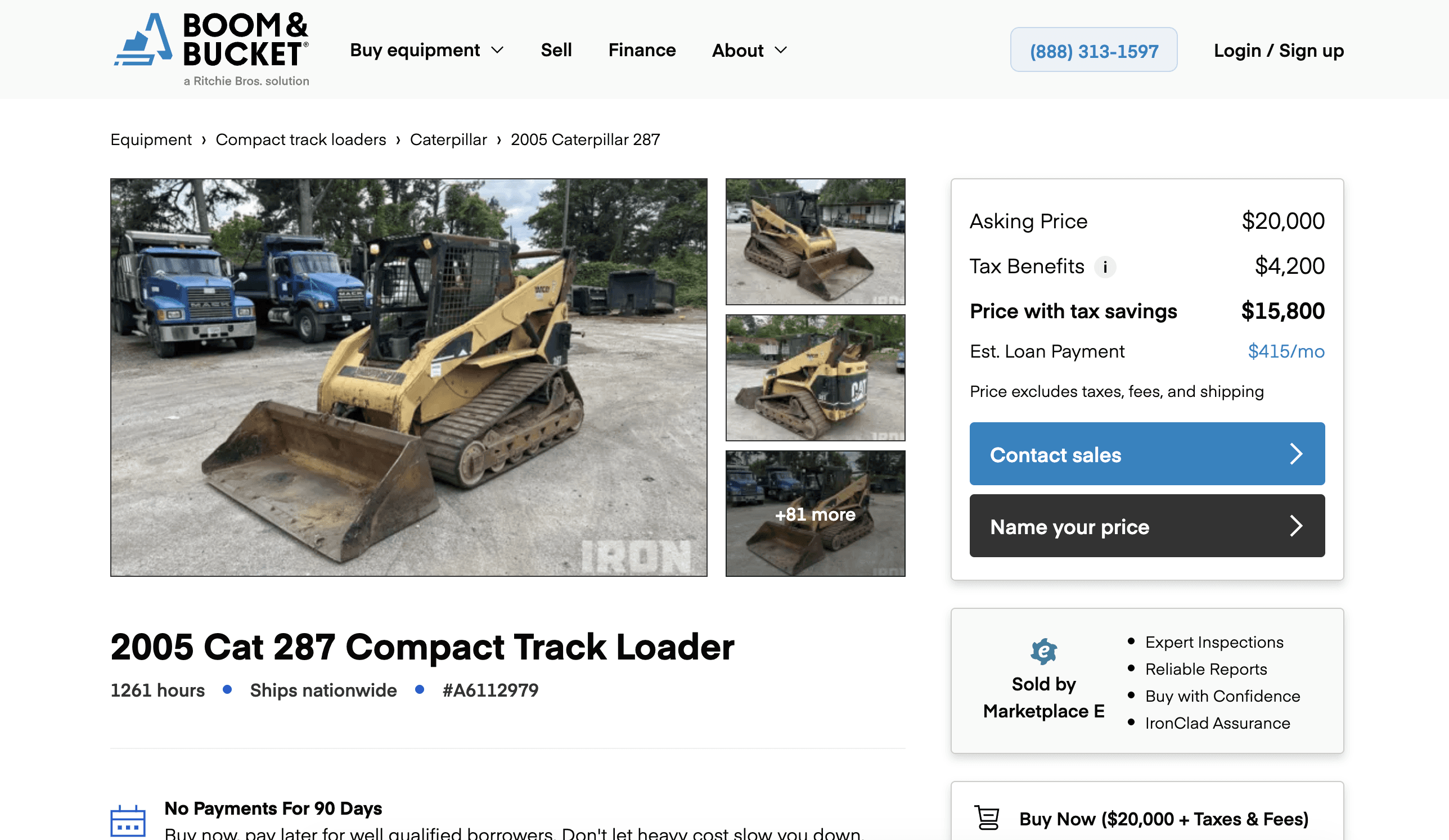
Heavy equipment doesn't sell at sticker price. But every Boom & Bucket listing showed one confident number with no path to negotiate, so buyers who weren't ready to pay full price just closed the tab. Sellers were almost always willing to take less. Neither side had a way to know that about the other.
Impacts at a glance
3x lift in lead form conversion on listings with Name Your Price enabled
30% increase in closed deals tied to the new offer flow
Cut down "what's your best price?" cold contacts to the sales team
Gave sellers a way to signal flexibility without lowering their list price publicly
The Problem
Heavy equipment doesn't sell at sticker price. But every Boom & Bucket listing showed one confident number with no path to negotiate, so buyers who weren't ready to pay full price just closed the tab. Sellers were almost always willing to take less. Neither side had a way to know that about the other.
Impacts at a glance
3x lift in lead form conversion on listings with Name Your Price enabled
30% increase in closed deals tied to the new offer flow
Cut down "what's your best price?" cold contacts to the sales team
Gave sellers a way to signal flexibility without lowering their list price publicly
Design Decisions
Three core decisions, each tied to one of the insights.
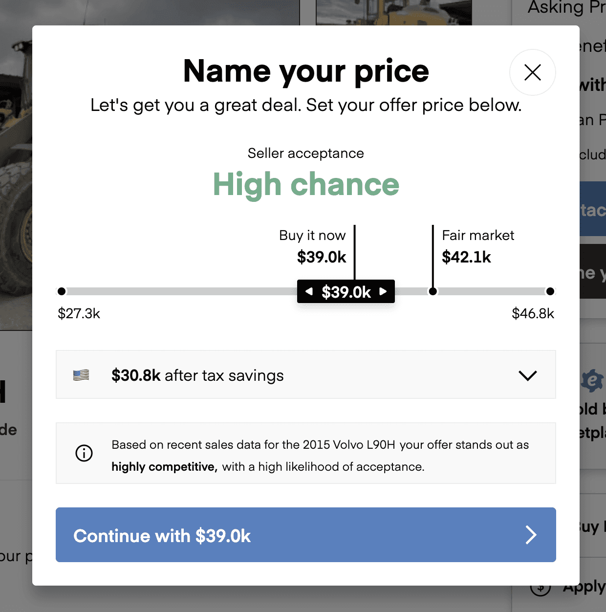
Anchoring before action. Before a buyer ever typed a number, the offer flow showed context. A suggested offer range based on the listing, framed as what sellers were likely to accept. It wasn't a hard floor. Buyers could still go lower if they wanted. But it set expectations and cut down lowball noise dramatically. The anchoring was the single highest-leverage choice in the whole project. Without it, the system doesn't work.
Seller-defined guardrails. Sellers set an acceptable range when they enabled Name Your Price. Offers above the upper bound auto-accepted. Offers below the lower bound got a polite "this is below what the seller will consider" message and a chance to revise. Buyers weren't blocked, just informed. Offers in the middle went to the seller for review. That kept sellers in control without making them babysit every offer that came in.
Instant accept, counter, or decline. The whole flow had to feel fast. Buyers got immediate feedback. Either an instant accept, an automated message, or a clear "the seller will respond within X hours." No black-hole submissions. No "we'll get back to you." The marketplace had to feel alive.
I made some smaller calls that mattered too. Framing the entry point as "Make an Offer" rather than "Negotiate," which matched insight #2. Keeping the offer form to a single screen with the anchoring visible the whole time. And building the seller a normalized review view so they could make a call in seconds instead of minutes.
Research
I went in with three questions. Why are buyers bouncing? What do they actually want? And what do comparable marketplaces do that works?
Buyer interviews. I talked to recent buyers and people who'd contacted us but never closed. The pattern showed up fast and it was consistent. They assumed the price was firm. A few told me they figured Boom & Bucket was "more like Carvana than Craigslist," that the number on the page was the number. Others said they'd bought elsewhere because a competitor's listing let them submit an offer in two clicks.
Data analysis. I pulled funnel data on listings over the prior six months. Drop-off at the contact step was way worse than every step before it. Buyers were getting deep into listings, high intent signals everywhere, and then disappearing. I also looked at closed deals and found the gap between list price and final sale price was rarely zero. Sellers were already negotiating. We just weren't surfacing it anywhere in the product.
Competitive analysis. I studied how negotiation worked across eBay Motors, Facebook Marketplace, IronPlanet, MachineryTrader, and a few B2B equipment platforms. The patterns clustered into three models. Open auction (loud, anxiety-inducing). Private offer (buyer submits a number, seller responds). And "best offer" anchoring (platform suggests a reasonable range). The private offer model with smart anchoring had the cleanest UX, and it was the closest match to how heavy equipment actually changes hands offline.
Insights
Three things crystallized from the research.
1. Listings felt "take it or leave it" even when they weren't. This was the big one. The fixed price wasn't the real problem. The appearance of finality was. Sellers were flexible. Buyers had no way to know.
2. Buyers don't want to negotiate. They want to make an offer. That distinction matters more than it sounds. Negotiation implies a back-and-forth with a person. An offer is a single act. You submit a number and you're done. That framing lowers the activation energy a lot, especially for buyers who aren't natural hagglers.
3. The real risk was anchoring chaos. If we just slapped a "make an offer" button onto listings with no guidance, we'd get lowball offers all day. Sellers would get annoyed. The whole system would collapse on itself. The design had to do real work to keep offers in a reasonable zone.
Research
I went in with three questions. Why are buyers bouncing? What do they actually want? And what do comparable marketplaces do that works?
Buyer interviews. I talked to recent buyers and people who'd contacted us but never closed. The pattern showed up fast and it was consistent. They assumed the price was firm. A few told me they figured Boom & Bucket was "more like Carvana than Craigslist," that the number on the page was the number. Others said they'd bought elsewhere because a competitor's listing let them submit an offer in two clicks.
Data analysis. I pulled funnel data on listings over the prior six months. Drop-off at the contact step was way worse than every step before it. Buyers were getting deep into listings, high intent signals everywhere, and then disappearing. I also looked at closed deals and found the gap between list price and final sale price was rarely zero. Sellers were already negotiating. We just weren't surfacing it anywhere in the product.
Competitive analysis. I studied how negotiation worked across eBay Motors, Facebook Marketplace, IronPlanet, MachineryTrader, and a few B2B equipment platforms. The patterns clustered into three models. Open auction (loud, anxiety-inducing). Private offer (buyer submits a number, seller responds). And "best offer" anchoring (platform suggests a reasonable range). The private offer model with smart anchoring had the cleanest UX, and it was the closest match to how heavy equipment actually changes hands offline.
Insights
Three things crystallized from the research.
1. Listings felt "take it or leave it" even when they weren't. This was the big one. The fixed price wasn't the real problem. The appearance of finality was. Sellers were flexible. Buyers had no way to know.
2. Buyers don't want to negotiate. They want to make an offer. That distinction matters more than it sounds. Negotiation implies a back-and-forth with a person. An offer is a single act. You submit a number and you're done. That framing lowers the activation energy a lot, especially for buyers who aren't natural hagglers.
3. The real risk was anchoring chaos. If we just slapped a "make an offer" button onto listings with no guidance, we'd get lowball offers all day. Sellers would get annoyed. The whole system would collapse on itself. The design had to do real work to keep offers in a reasonable zone.
Solutions
The shipped product had four key surfaces.
On the listing. A "Make an Offer" call-to-action that sat alongside the list price. Not replacing it, complementing it. Subtle, confident, and consistent enough that buyers learned the pattern as they browsed.
The offer flow. A focused, single-screen experience. Anchoring shown immediately. Plain-language explanation of what happens next. A required field for buyer contact info that doubled as the lead capture, which is where the 3x conversion lift came from.
The seller dashboard. A clean review interface showing each offer with the context the seller needed. Offer amount, buyer info, days the listing had been live, comparable activity. Three big actions: accept, counter, decline. Counter offers reopened the loop on the buyer side with the same anchoring logic running underneath.
The notification system. Both sides got fast, clear updates. Sellers knew when an offer came in. Buyers knew the moment a seller responded. The system felt responsive even when humans were the bottleneck.
Reflections
The thing I'm proudest of isn't actually the conversion numbers. It's that the feature changed the posture of the marketplace. Boom & Bucket stopped feeling like a catalog and started feeling like a conversation. That's a hard thing to design for and the kind of shift that compounds over time.
If I were doing it again, I'd push harder on two things.
First, I'd invest earlier in the seller side. We spent most of our discovery time with buyers because buyers were the visible drop-off. But sellers turned out to be the tougher audience to design for. They had more emotional weight in the outcome, and a clunky seller experience would have killed the feature no matter how good the buyer flow was. We caught it in time, but barely.
Second, I'd build more measurement into the anchoring itself. That suggested range was the load-bearing decision of the entire design. A more instrumented version would have let us tune anchoring over time and probably squeeze another meaningful lift out of the same surface.
The bigger lesson, the one I carry into every project now, is that the most valuable feature isn't always a new capability. Sometimes it's just giving people permission to do something they were already trying to do.
Solutions
The shipped product had four key surfaces.
On the listing. A "Make an Offer" call-to-action that sat alongside the list price. Not replacing it, complementing it. Subtle, confident, and consistent enough that buyers learned the pattern as they browsed.
The offer flow. A focused, single-screen experience. Anchoring shown immediately. Plain-language explanation of what happens next. A required field for buyer contact info that doubled as the lead capture, which is where the 3x conversion lift came from.
The seller dashboard. A clean review interface showing each offer with the context the seller needed. Offer amount, buyer info, days the listing had been live, comparable activity. Three big actions: accept, counter, decline. Counter offers reopened the loop on the buyer side with the same anchoring logic running underneath.
The notification system. Both sides got fast, clear updates. Sellers knew when an offer came in. Buyers knew the moment a seller responded. The system felt responsive even when humans were the bottleneck.
Reflections
The thing I'm proudest of isn't actually the conversion numbers. It's that the feature changed the posture of the marketplace. Boom & Bucket stopped feeling like a catalog and started feeling like a conversation. That's a hard thing to design for and the kind of shift that compounds over time.
If I were doing it again, I'd push harder on two things.
First, I'd invest earlier in the seller side. We spent most of our discovery time with buyers because buyers were the visible drop-off. But sellers turned out to be the tougher audience to design for. They had more emotional weight in the outcome, and a clunky seller experience would have killed the feature no matter how good the buyer flow was. We caught it in time, but barely.
Second, I'd build more measurement into the anchoring itself. That suggested range was the load-bearing decision of the entire design. A more instrumented version would have let us tune anchoring over time and probably squeeze another meaningful lift out of the same surface.
The bigger lesson, the one I carry into every project now, is that the most valuable feature isn't always a new capability. Sometimes it's just giving people permission to do something they were already trying to do.






Frank © 2026. Designed by Frank Aguilar
Frank © 2026. Designed by Frank Aguilar